Imagining a Better Social Media
Social media has seen better days
Between the negative impacts on mental health, the spread of disinformation, and concerns with data privacy, the problems with social media seem more in the spotlight than ever before. The Social Dilemma, a recent Netflix documentary highlighting these problems (with help from the people who created them), has reached 100 million people in 190 countries 1. It’s no exaggeration to say the problems with social media are a mainstream topic.
Thankfully, this visibility has also led to more awareness. At the end of The Social Dilemma, several countermeasures are recommended, including turning off notifications, uninstalling apps, and thinking twice before sharing clickbait material. There are now browser extensions that will block recommendations and news feeds, and instead encourage intentional browsing.
These are all great, but they are only temporary patches. We can only work around a broken system for so long. For a lasting change, we need to rethink the system itself. There has been some discussion around this, such as this twitter thread of what a better social network would look like, and this guide to human-centric principles for new technologists. But most of the discussion has been at a high level. For meaningful progress, we need to get specific.
What would social media look like if it were designed today? What features should we add or remove? How do we build something that users want AND is good for them? To explore these questions, I’ll start with the user I know best - myself.
How would I design the ideal social media for me, knowing what I know today?
My Experience with Social Media
First, it helps to reflect on my own experience. For context, I have primarily used Facebook to connect with friends since 2010. I recently started using Twitter, and very occasionally check Instagram.
The Good
There are several use cases where social media adds value to my life. These include:
- Sharing occasional life updates or new content with friends and receiving supportive comments and engagement
- Posing a question or asking for recommendations and receiving thoughtful responses, sometimes from people I don’t normally talk to
- Seeing updates every few days from ~5-10 close friends (who I’ve marked as Show First on Facebook)
- Seeing major life updates every few months from a wider range of acquaintances
- Directly checking the Twitter feeds of ~5-10 people I admire and learning something new or getting inspiration
- Visiting David Goggin’s Instagram page and receiving a healthy dose of motivation.2
More generally, I am happy about my social media use when I feel like I am able to seek out updates intentionally from the people I care about. When my browsing is centered on people, not posts. When I choose what content I want to see, not the algorithm. The added serendipity of the algorithm can be nice to periodically check-in with distant connections or discover new people, but for the most part I am happiest when not pulled away on distractions and tangents.
The Bad
My worst experiences with social media include:
- Scrolling through my Facebook and Twitter feeds for a “quick break” only to get sucked in and come out scattered, disoriented, and anxious
- Sharing a post, then spending too much time checking for new notifications that it distracts me from meaningful work.
- Procrastinating by opening the apps for a brief dopamine hit of relief from whatever happens to show up on my feed
Most of my bad experiences involve falling into the short-term reward traps. Features that were designed to take advantage of our primitive brains to increase engagement - notifications, the algorithm, and the infinite news feed - pulled me into spending more time on these platforms than I was happy with. In past attempts to manage this problem, I’ve deleted apps from my phone and deactivated my Facebook account several times.
A Better Social Media
How would I design a social media platform that maximizes the positive value while minimizing the negative aspects? Here are some ideas.
1. Post without Distractions
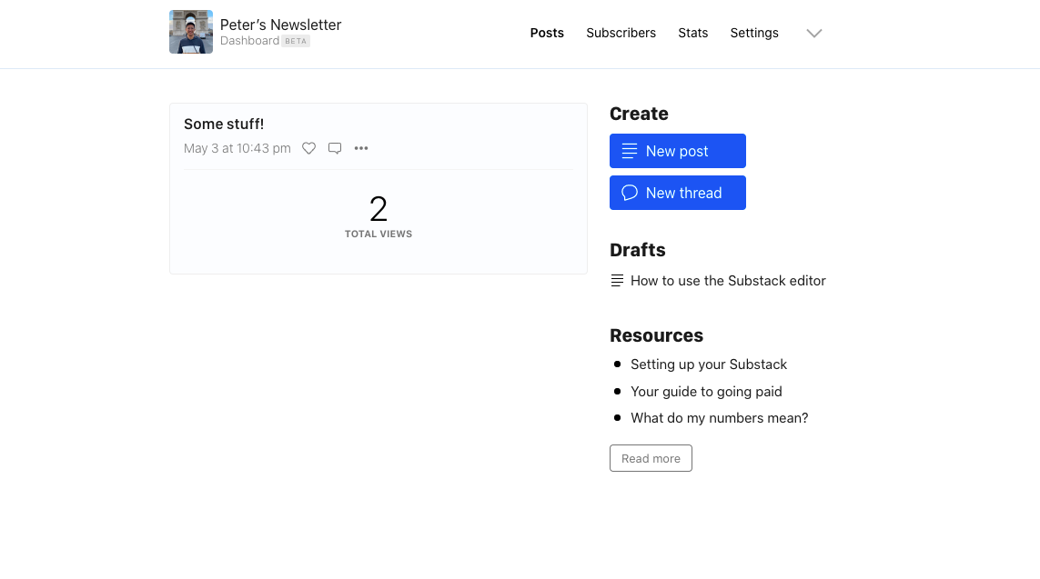
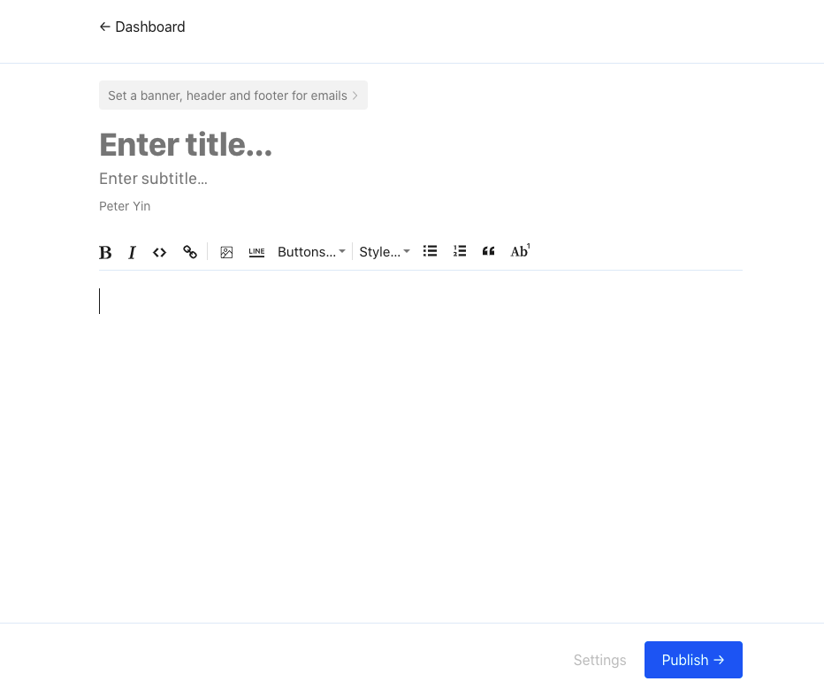
If I want to post something on Facebook or Twitter, or Instagram, I have to go through the home page, where I’m met with a stream of content and notifications carefully curated to steal my attention. Instead, we could encourage more intentional usage by making the home page a minimal space where one can publish content without the noise of a newsfeed in the background. Substack’s dashboard does a good job of this for newsletters.

Substack User Dashboard

Substack Post Interface
2. Center on People, not Posts
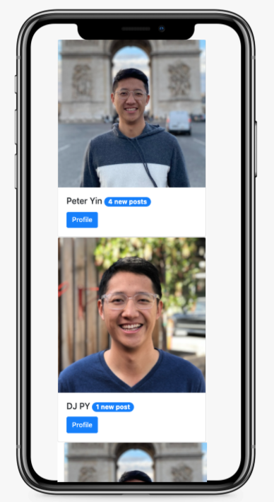
Instead of a feed of posts, we should have a feed of people we care about. Each person can be a card with their photo and name. When you click on their card, it takes you to their profile with their latest updates. People can be organized into different categories - close friends, acquaintances, influencers, etc, and those with new updates can be pinned at the top. With this design, I can still keep up to date with people I care about, but do it on my own terms. Scrolling through people instead of posts would also discourage the mindless scrolling that comes with an infinitely refilling feed.

Super rough rendition of feed centered on people
3. Replace the feed with a Digest
Instead of receiving notifications throughout the day, we should batch updates in a daily digest that you can read every morning. Similar to reading the morning paper with your cup of coffee, you can get a consolidated view of updates from the 10-20 people you care most about. Every week or month, we could consolidate updates from a wider range of acquaintances, akin to the “Sunday Paper” of print newspapers. This would allow me to still stay connected in meaningful ways without unnecessarily consuming precious time and attention.
But what about all the other issues?
I haven’t mentioned anything about how this better social media would become a sustainable business, nor how it would address the major issues with social media companies today, including content moderation, data privacy, and polarization. My gut feeling is that the profitability will be increasingly related to these issues in the future.
This particular thought experiment focuses on the aspects of social media that personally affect my wellbeing the most. However, I do believe that on a long enough time horizon, tools that align their incentives with human wellbeing will come out on top.
Conclusion
Social media is ripe for an evolution. Let’s use the lessons of hindsight and our personal experiences to re-imagine what a wholesome social internet looks like. Then let’s make it happen.
Thanks Kathleen Sun for reviewing drafts of this essay
-
No seriously, check it out. Best way to remind yourself to workout when you don’t feel like it. ↩︎